


March 31, 2024 – Microsoft is experimenting with a novel design for the Start menu in Windows 11, shifting away from the conventional alphabetical vertical listing of apps under the “All Apps” section. Instead, the tech giant is exploring a grid layout reminiscent of the Start menu found in Windows 10X.
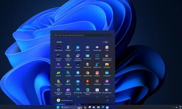
In an effort to streamline the Start menu experience, Windows 11 has already phased out dynamic tiles in favor of a simpler icon-based approach. Currently, in the stable version of the operating system, clicking on “All Apps” reveals a lengthy list of installed applications sorted alphabetically.
The proposed redesign aims to replace this vertical list with a visually appealing grid of icons. This new layout, which is currently being tested by Microsoft, promises a cleaner and more efficient use of screen space, allowing users to view more apps at a glance without the need for scrolling. The larger and more distinguishable icons are also expected to facilitate faster app identification and selection.
However, this radical change does not come without its challenges. One potential concern is that users with extensive app libraries might find the grid layout overwhelming or cluttered. An excess of visual elements could potentially hinder readability, especially when it comes to app names. Furthermore, those accustomed to the traditional list format might require some time to adapt to this new method of app navigation.