


February 5, 2025 – OpenAI has announced the completion of a comprehensive brand refresh, unveiling a new font, logo, and color scheme.
At first glance, the differences between OpenAI’s old and new logos may seem subtle. However, upon closer inspection, it becomes apparent that the updated “flower” logo features a slightly enlarged central space and more streamlined, elegant lines. The redesign was spearheaded by OpenAI’s internal design team, led by Veit Moeller and Shannon Jager. According to a report by Wallpaper, the team’s objective was to craft a more organic and humanized brand identity for OpenAI.
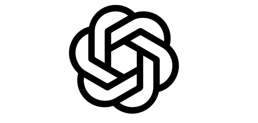
As part of this brand refresh, OpenAI has also introduced a new font, OpenAI Sans. Described as a typeface that “combines geometric precision and functionality with a rounded, approachable quality,” OpenAI Sans embodies the company’s new visual identity. Notably, in the new brand logo, the letter “O” adopts a perfectly circular shape while maintaining some imperfect details within, a design choice meant to “offset any sense of overly mechanical precision and bring a more human touch to the brand,” as explained by Moeller.
When asked about the use of AI tools, such as ChatGPT, in the design process, Moeller clarified that the team only utilized ChatGPT to calculate different font weights. Designers from OpenAI revealed to Wallpaper that they collaborated with leading experts in photography, typography, motion, and spatial design, while also leveraging AI tools like DALL・E, ChatGPT, and Sora as creative partners. This dual approach, which combines human intuition with the creative potential of AI, has enabled OpenAI to craft a brand that is both innovative and deeply human.