


September 30, 2025 – On Monday local time, Google made an announcement that it is adopting a gradient – colored “G” logo as the new company – wide emblem. This new logo made its initial appearance in Google apps on both Android and iOS systems back in May this year, and it is set to be rolled out across all of the company’s platforms soon. This marks Google’s first significant logo update in a decade.
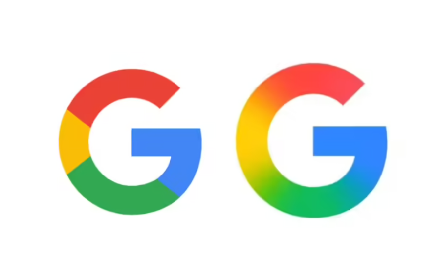
Back in 2015, Google introduced a colorful “G” logo where the red, yellow, green, and blue colors were distinct from one another. In contrast, the new logo blends these four colors together and also enhances the color saturation. Its design aesthetic is in line with the gradient – colored logo of Google’s Gemini. According to Google, this change is intended to reflect the company’s “evolution in the era of artificial intelligence.”
In addition to the new “G” logo, Google has also quietly updated the logo of Google Home, aligning its visual style with the new overall look.
Google has stated that the new design will see an even wider application in the “coming months.” This implies that users will soon be able to spot this gradient – colored design in other Google apps such as Gmail, Google Drive, Meet, and Calendar.